Broken Coast
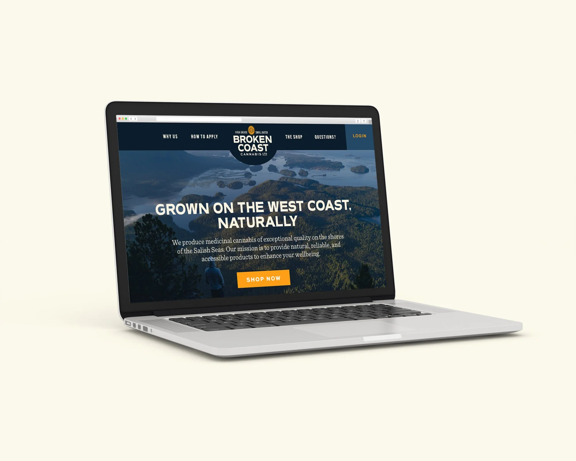
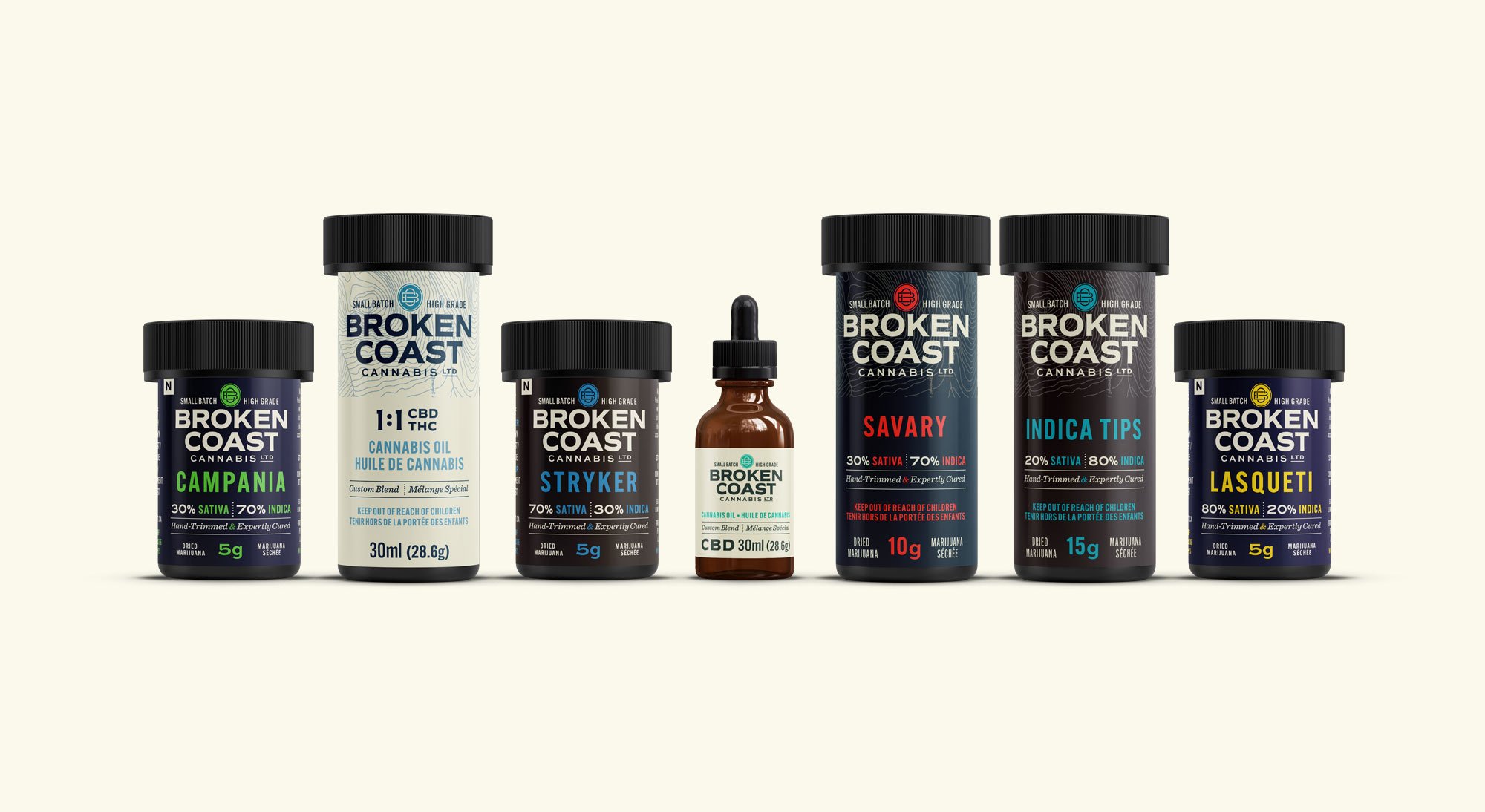
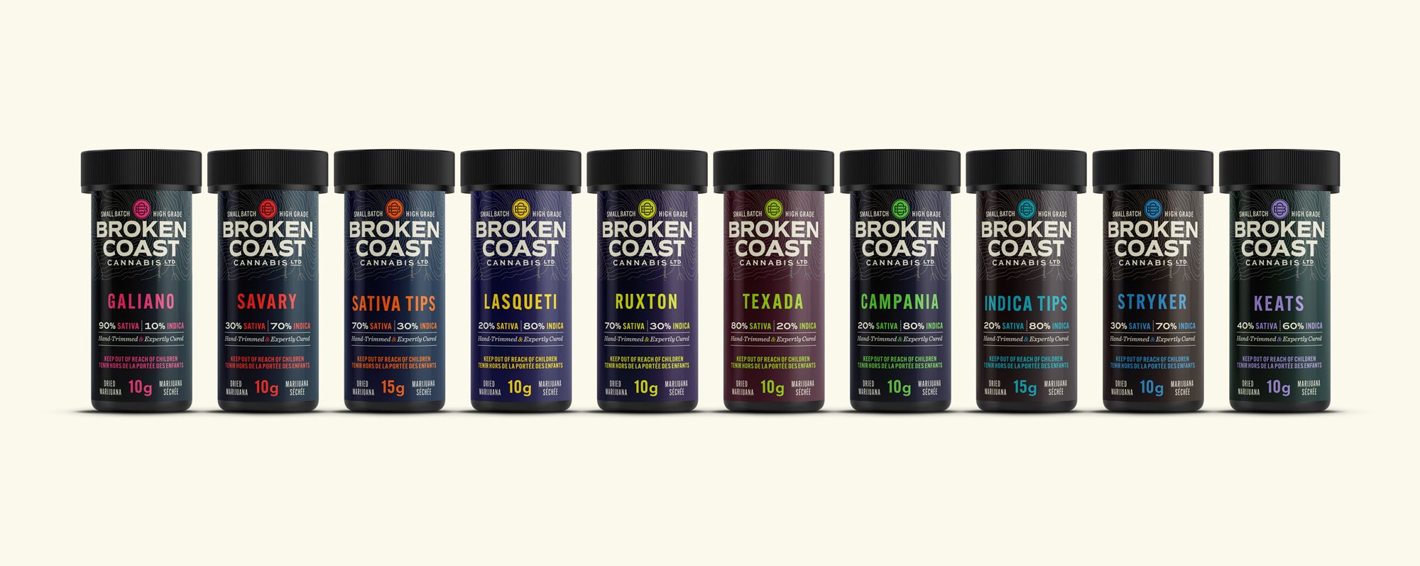
Broken Coast was Canada’s original premier producer of small batch cannabis. In late 2016 we were approached to redesign their branding, packaging, and website in anticipation of recreational legalization in 2018.


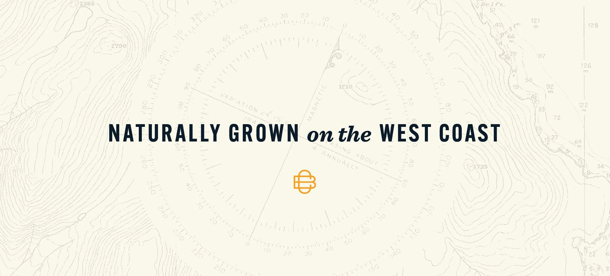
When this identity was created in 2017, the cannabis sector had undergone significant changes since Broken Coast was first founded, and consumers had already become far more sophisticated and discerning. As one of the first legal recreational cannabis brands, we felt that using any visual reference to a cannabis leaf was a bit too obvious. As well, using imagery that was even remotely associated with the stigmatized history of cannabis could be potentially detrimental in the future marketplace. With this in mind we stripped away any reference to cannabis itself, and instead created brand elements that reinforce Broken Coast's deep connection to British Columbia and the Pacific ocean.
UPDATE: In the years since this brand was created, the recreational cannabis branding landscape has changed dramatically. Although ‘legacy references’ were considered risky in 2017, times have changed. If I were to redesign Broken Coast today, context would demand a totally different solution.
Credits
Matt Webb
Creative Direction, Design
Katherine Webb
Design
