Tabletop
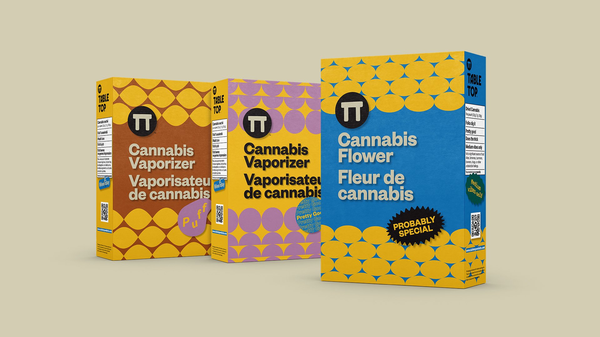
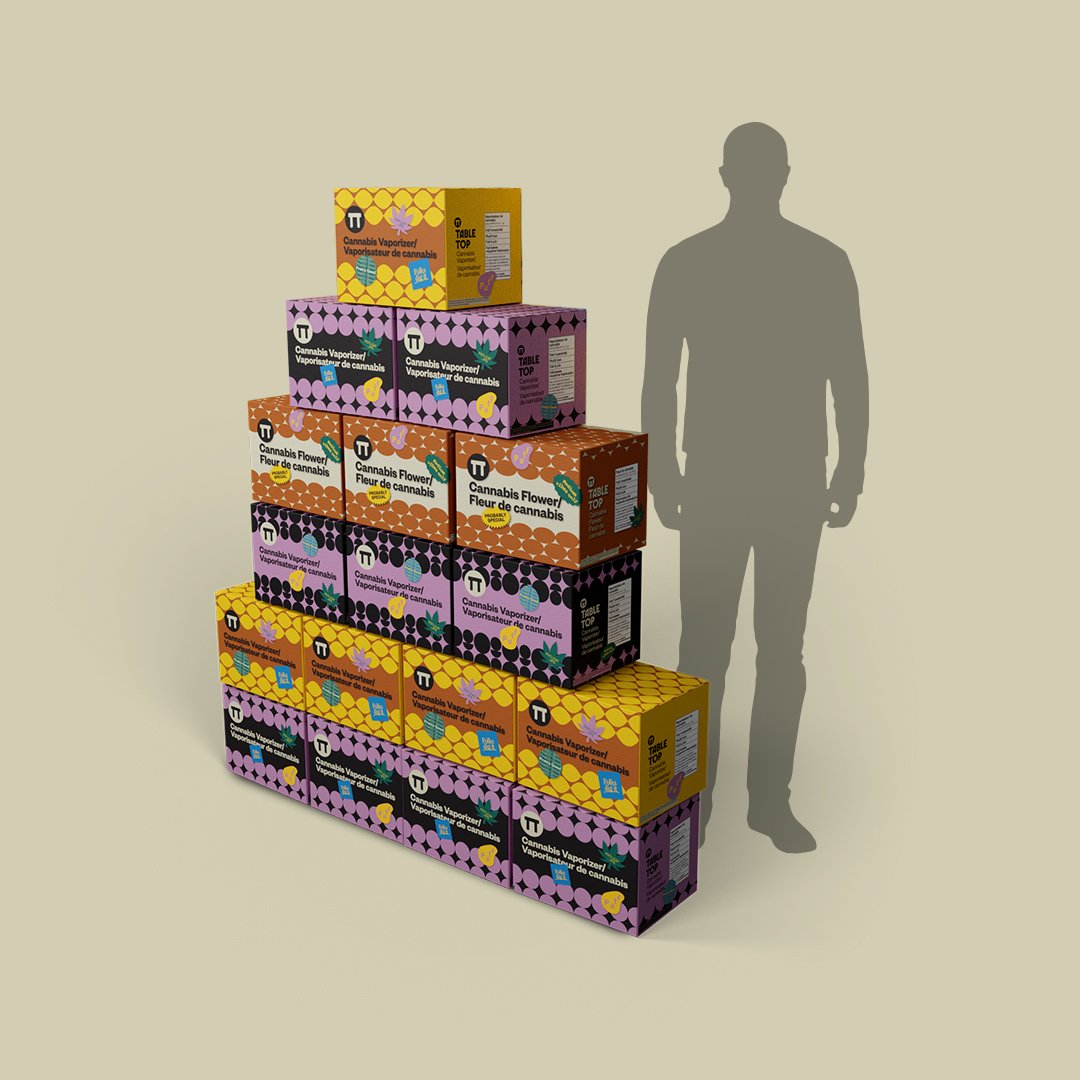
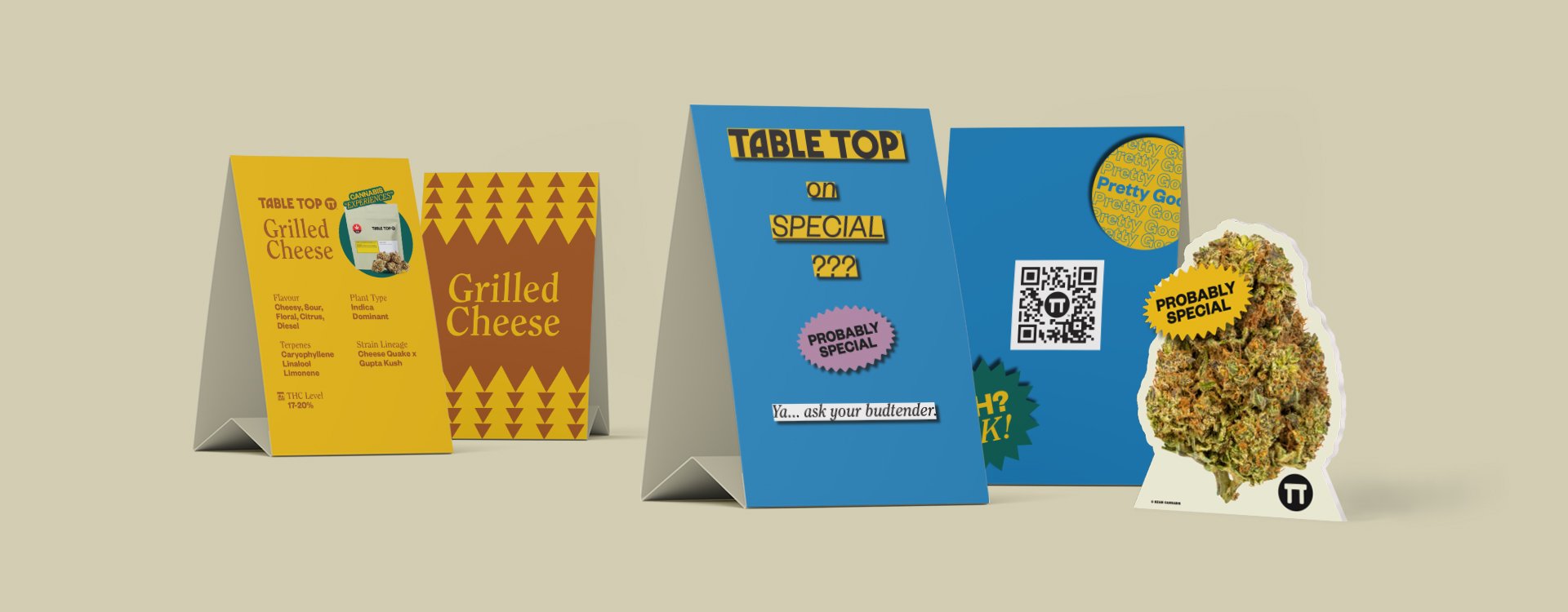
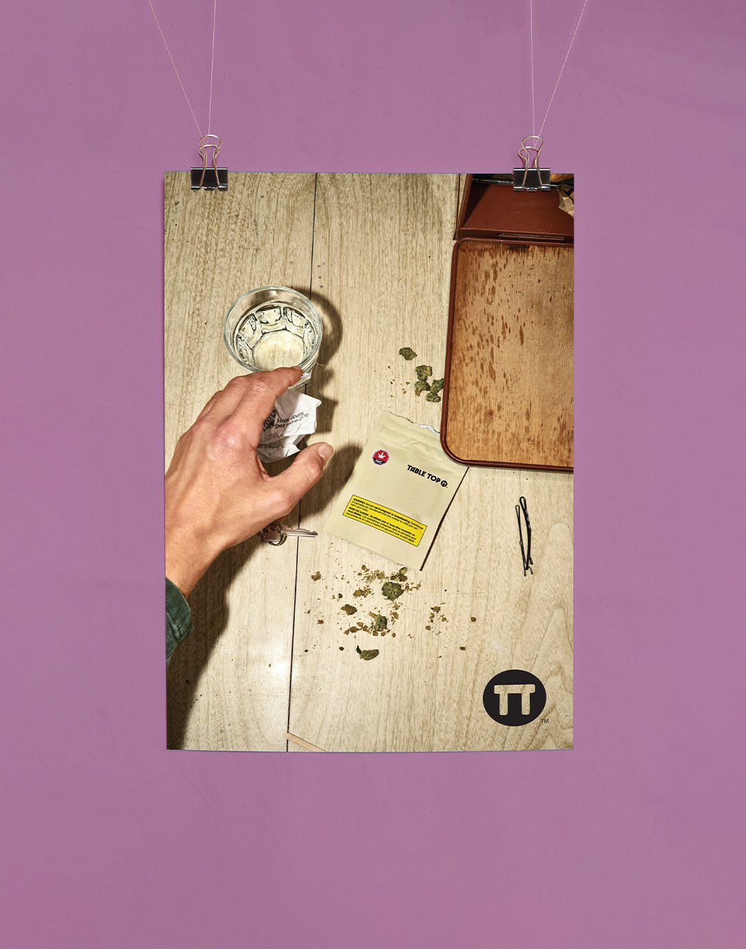
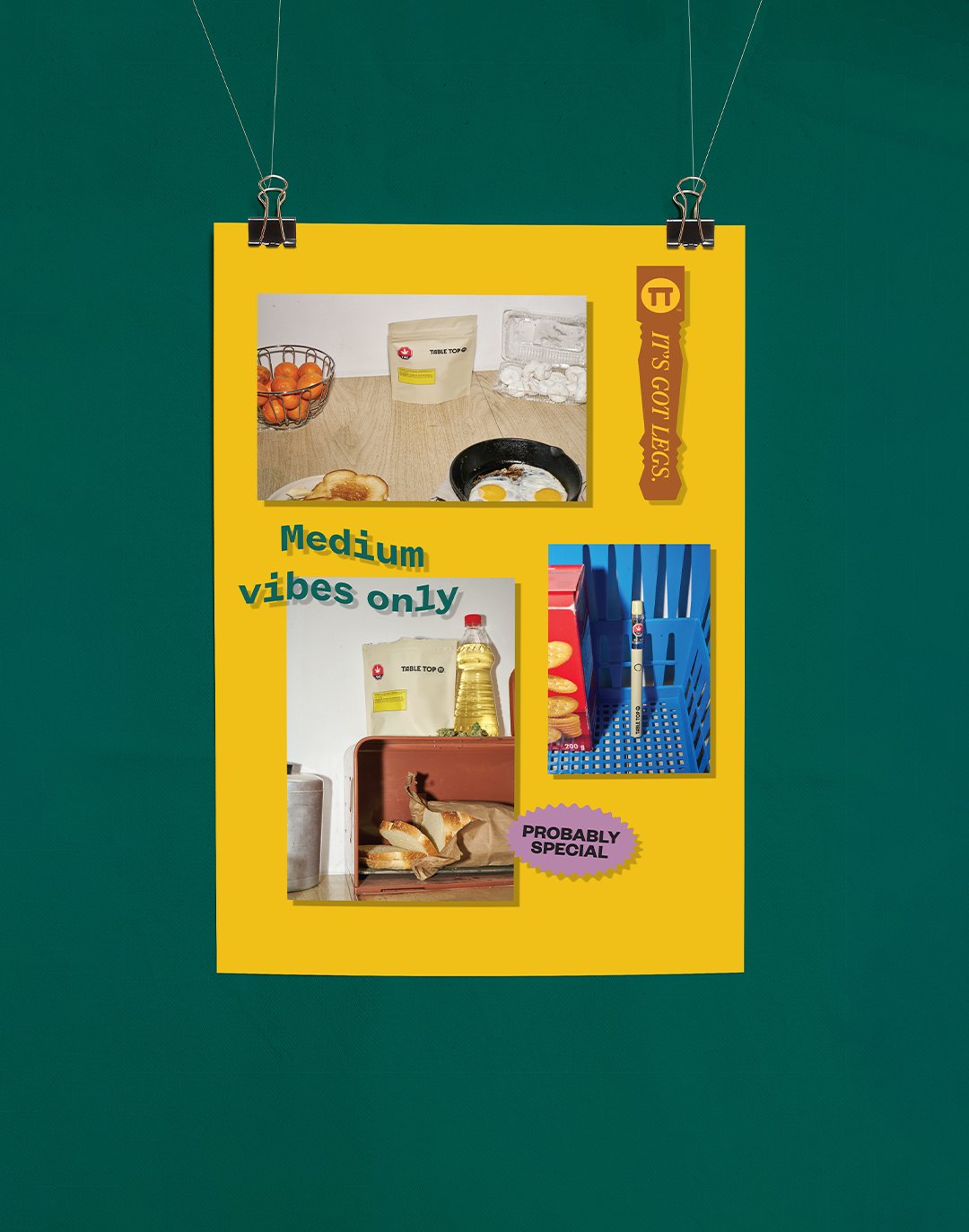
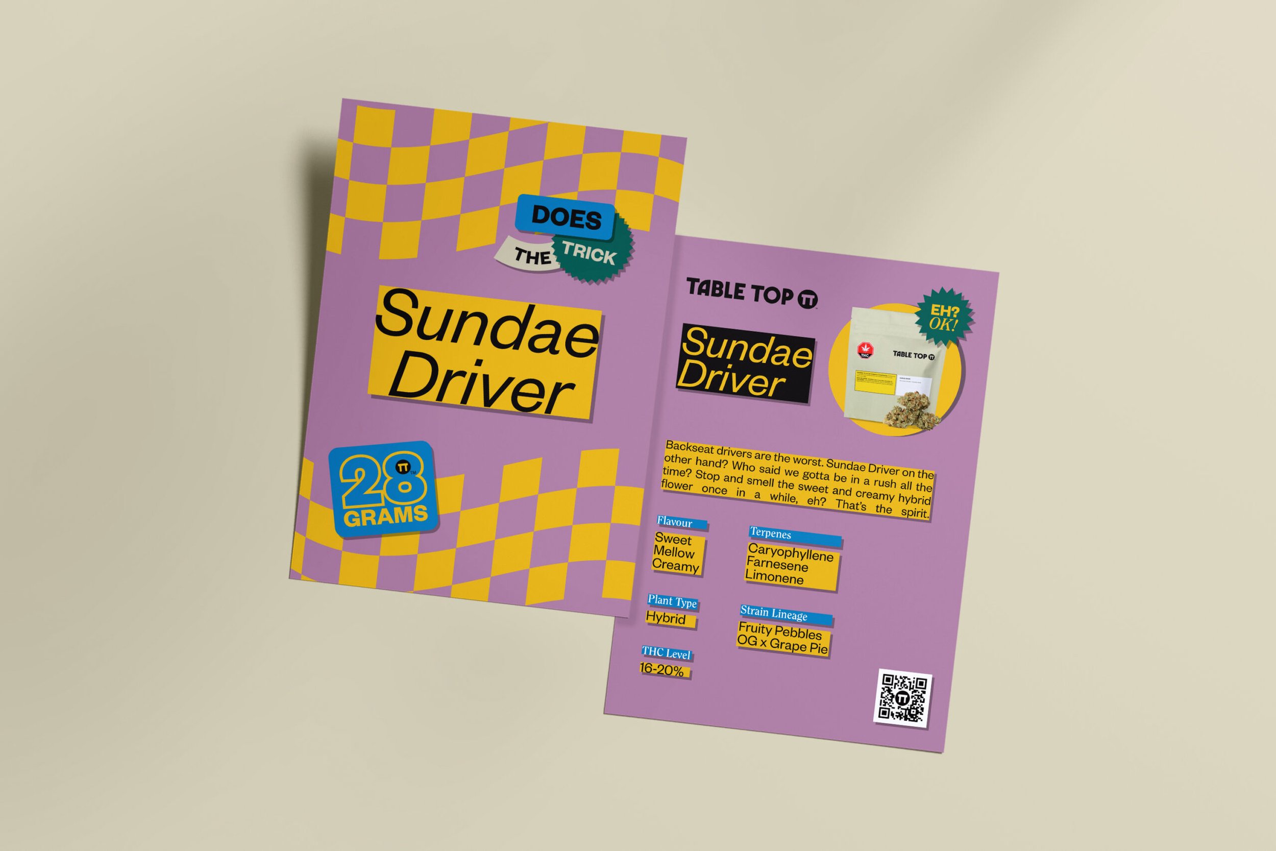
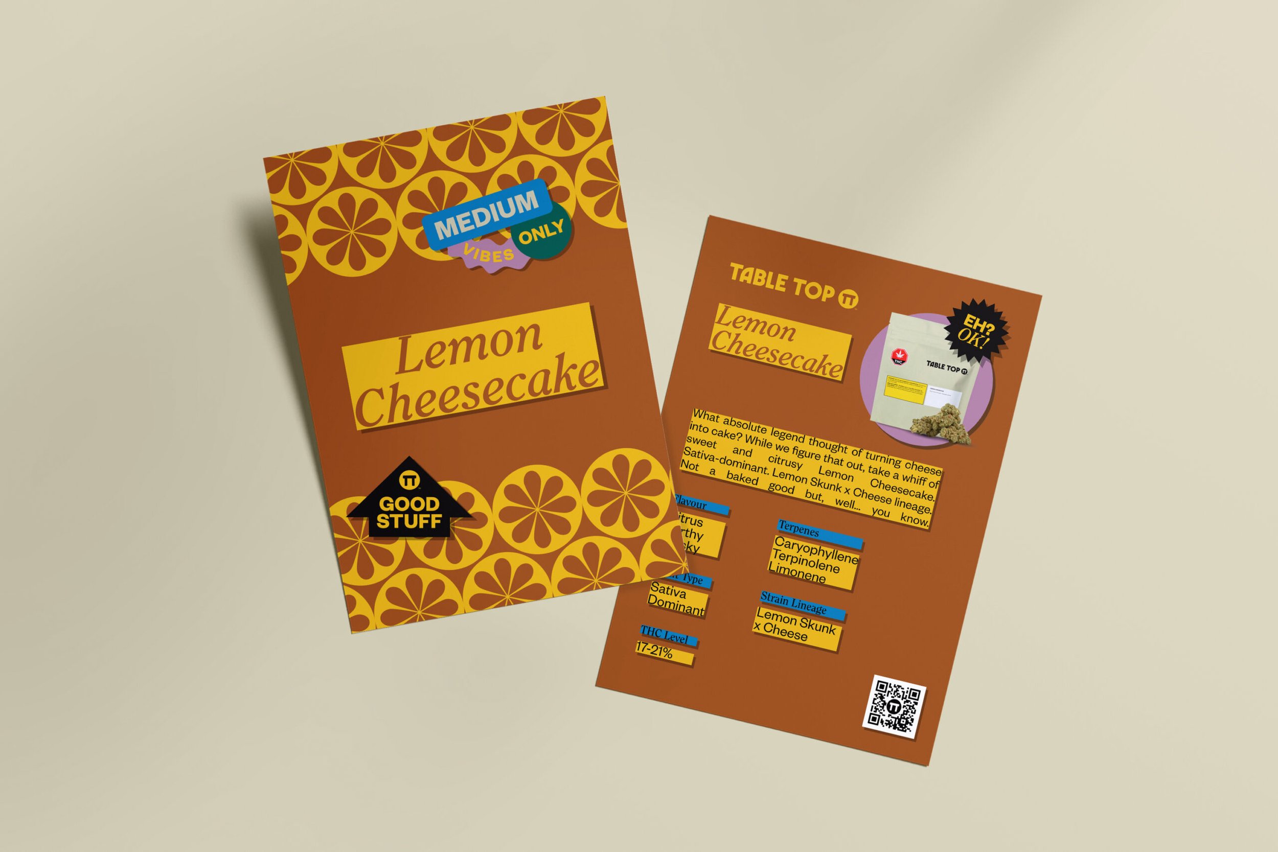
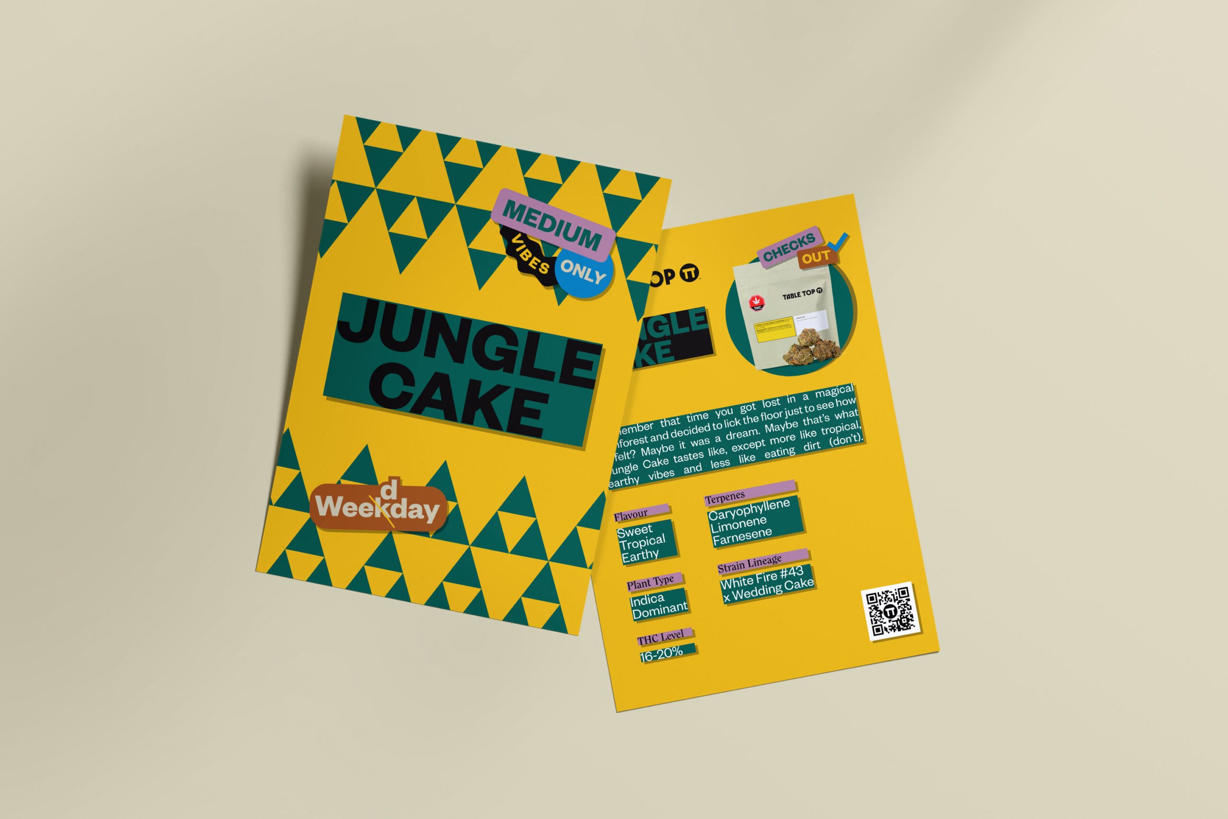
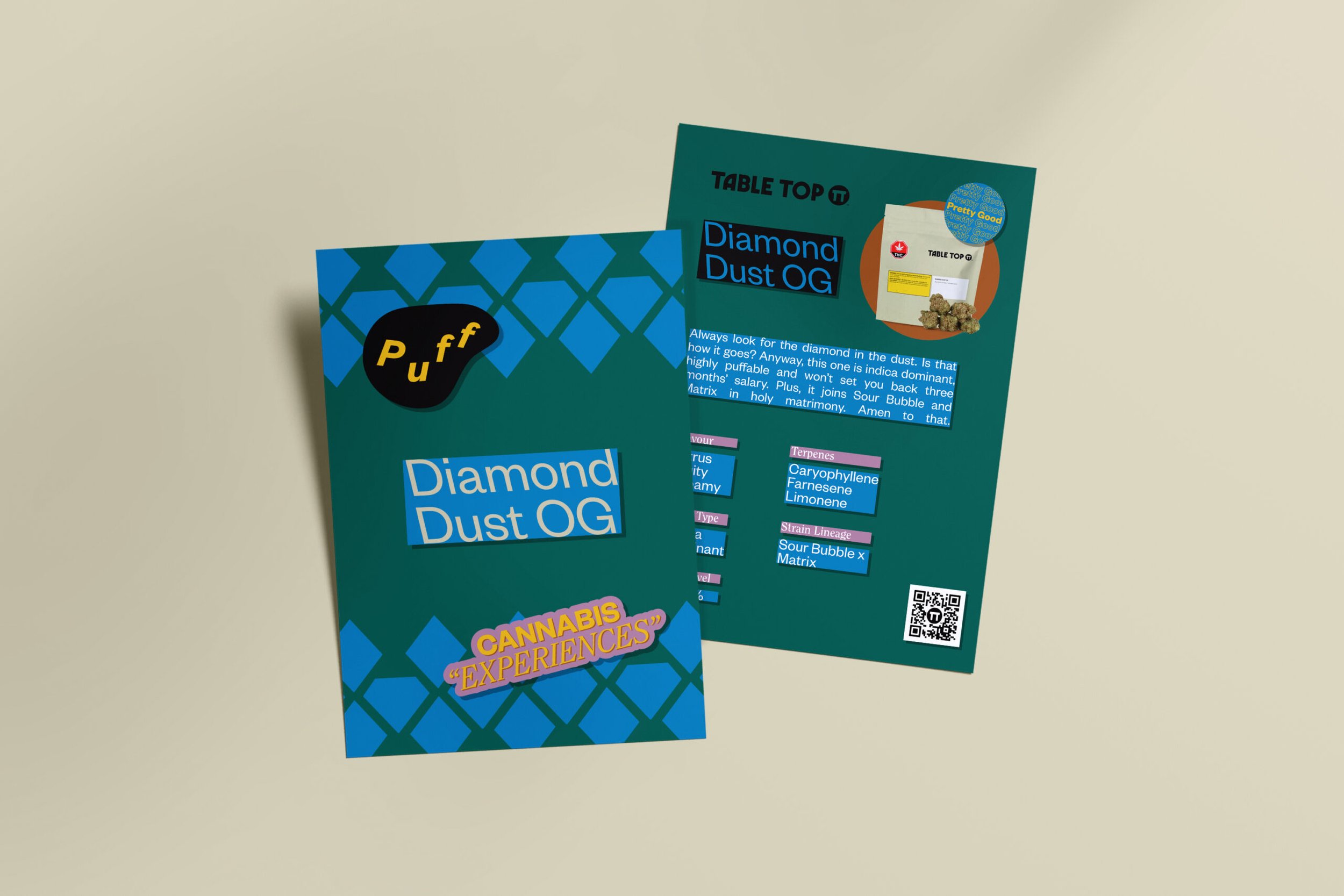
TableTop produces affordable cannabis that lands squarely in the middle, in all respects. It's pretty good, it produces "cannabis experiences, and it does the trick.







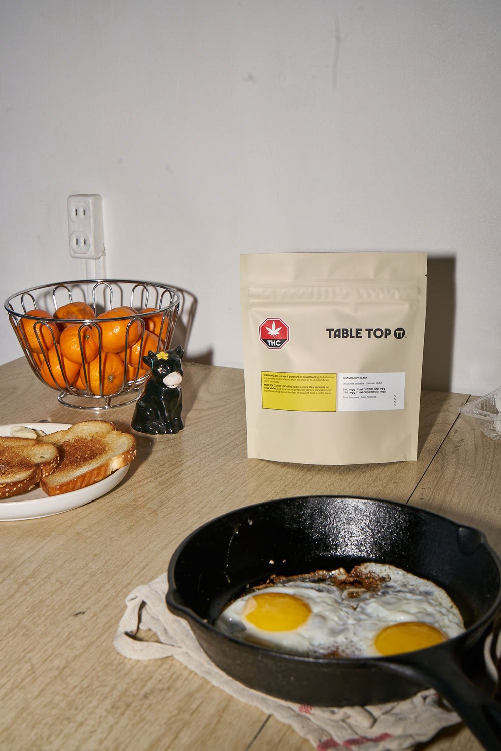

The Story
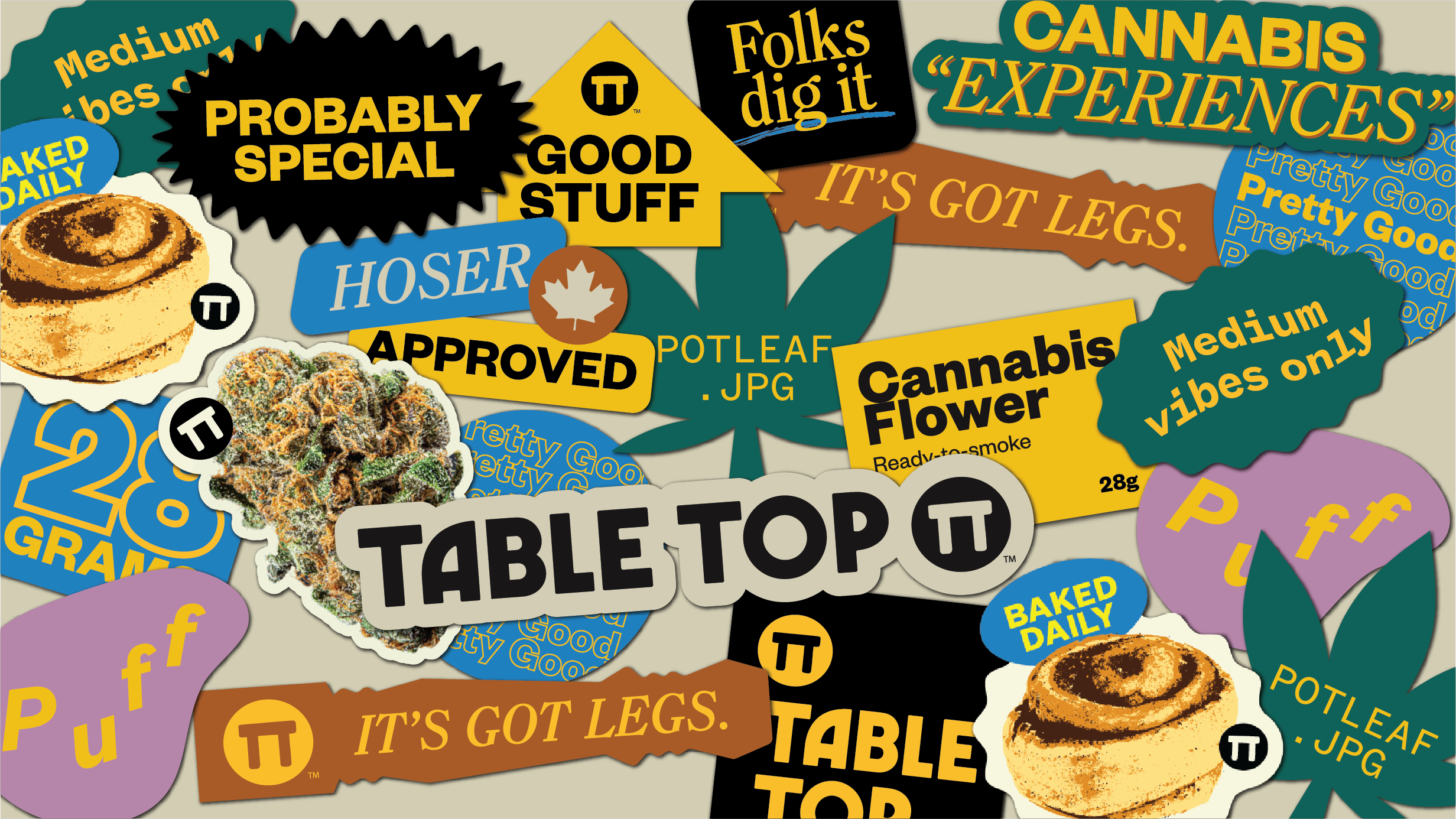
When we inherited the Tabletop brand, it was modernist and kooky, but it didn't scream MIDS the way we wanted it to. So, by reaching way back to our early days on Geocities, we gave it a Y2K makeover that more clearly reflects the brand's quality tier and irreverent voice.
This brand has everything ... GIFs with animated shine, scrolling HTML banners, boxed text just because, Times New Roman, and of course: a website with a working guestbook. (What's that, you ask?) It's that thing where people can send your website a message but nothing else. Like if Facebook was made by a nerdy android that doesn't understand friendship. (love you Stefon!)
If you're old enough to miss buying weed in a ziploc, you'll probably feel right at home with Tabletop's aesthetic. It's like being able to buy the late 90's in a bag, except instead of digital optimism it's just decent weed.
Credits
Matt Webb
Creative Direction
Katherine Webb
Creative Direction
Peter Chlebak
Original Identity Design
Christoper Li
Design
Gabrielle Cabrera
Photography
Adam Lang
Web Development
